Boosted user engagement by enabling instant connections
Scope
5 months, 2 phases
Product
Grindr
Role
Product Designer
Team
PM - Nicole Chu, Theodore Semon, UXR - Tyler Benes, FE - Nester Chung, Wesley Own, Peter Shih, Henry Huang, BE - Shawn Cook, Munir Estevane, Eric Gnatowski
Background
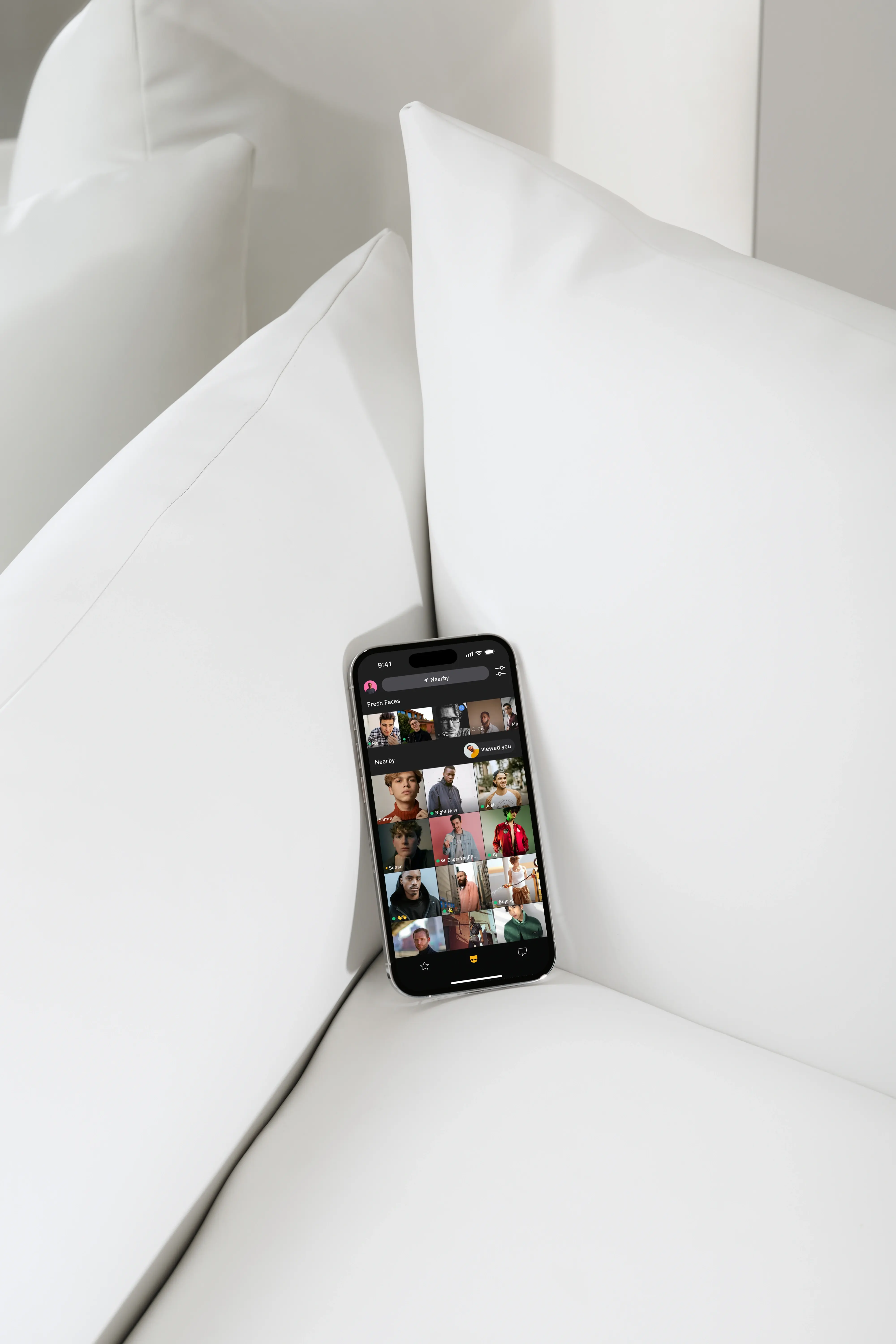
Viewed Me, the top-converting premium feature that revealed profile viewers and converted curiosity into connection, drove 20% of self-initiated purchases. Despite its impact, it remained untouched for years. As a growth product designer, I identified clear areas for improvement.
Mission
Our mission was to enable instant connections with profile viewers and increase willingness to subscribe to premium membership.
Story
Turned a quick win into a key driver of engagement and revenue.
I initiated a quick-win enhancement that evolved into a two-phase project with high impact. I collaborated with cross-functional stakeholders throughout the end-to-end process, running multiple A/B tests and rapid iterations. Meanwhile, I introduced micro-interactions that significantly increased app engagement.
Total Impacts
Average revenue per user
Click-through rate
Conversion rate
Profile click rate
Phase 1
The problems
Users saw Viewed Me as a way to spark instant connections based on fresh impressions after profile visits. However, the initial design failed to support this behavior.
Design Goals
Users should be notified when their profile was visited and experienced excitement from the interaction.
How might we enable users to form instant connections and infused excitement when their profile was visited.
Solution
Due to the tight timeframe, I rapidly developed multiple ideas and narrowed down to the one that most excited the product team during the weekly product meeting.
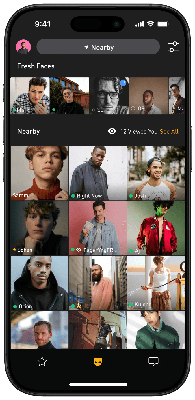
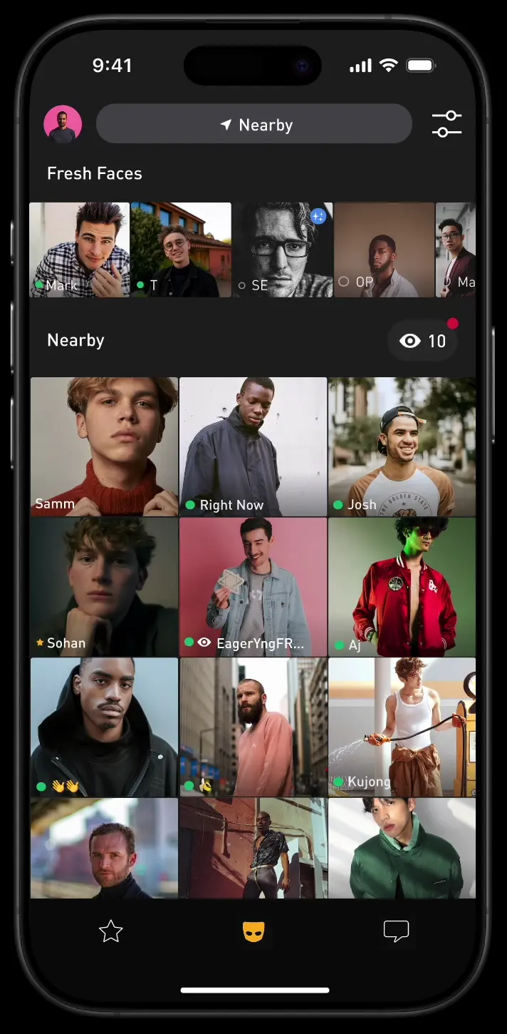
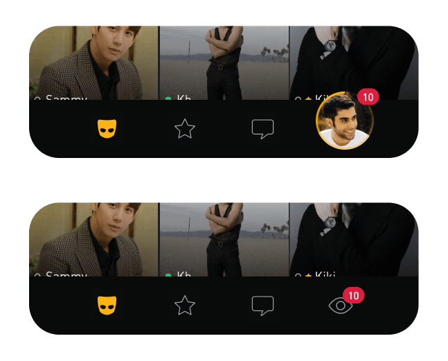
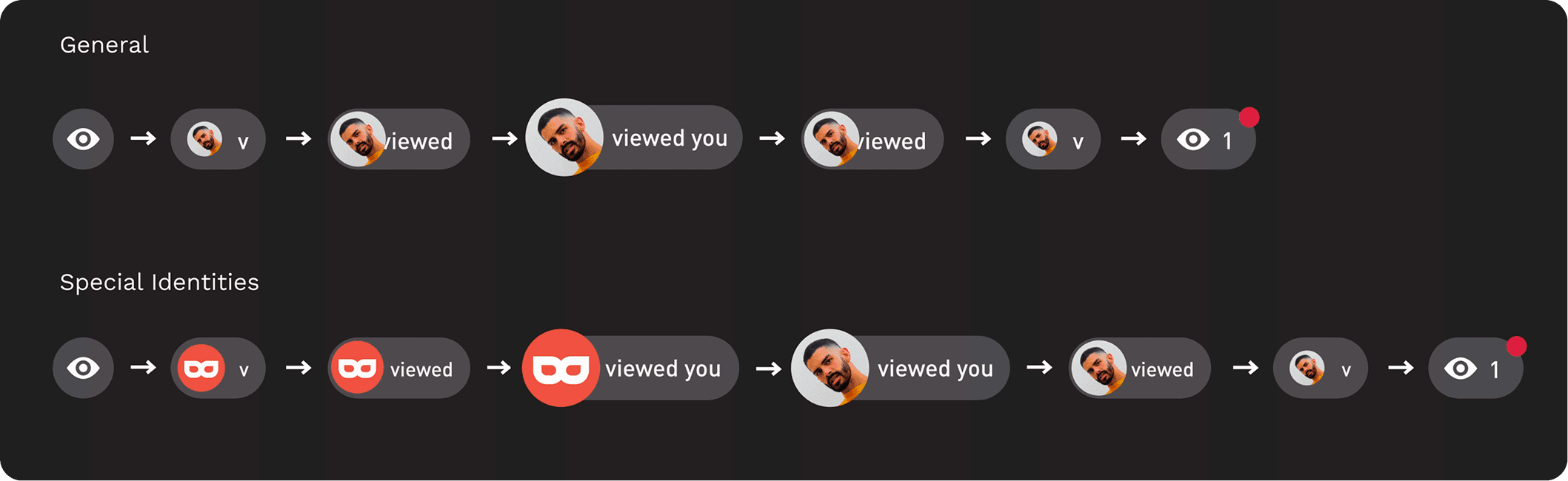
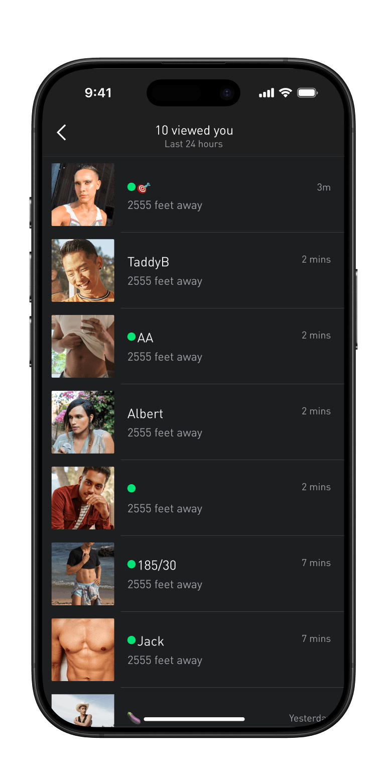
A real-time floating button featured a blinking eye and an unread red dot
I believed that no hypothesis was certain without seeing user real reactions. As a result, I quickly prototyped to gain approval from the manager and team, then delivered for the A/B test for user feedback.
OKRs
Click-through Rate
Conversion Rate
Profile Click-through Rate
Trouble shooting
Animations raised concerns about app performance, but I figured it out.
While implementing the animated eye icon, engineers worried it might slow the app. Rather than abandoning it, I researched Lottie and conducted tests with front-end teammates to ensure optimal performance.
Eventually, I successfully initiated micro-animations to the app, and Viewed Me became the 1st animated feature in Grindr user experience.
Result of Phase 1
Upsell initiative on Viewed Me page
Click-through rate
Conversion rate
New chat sent
Although traffic increased, the conversion rate grew less significantly than other metrics.
This indicated that while more users noticed the feature and intended to subscribe, an obstacle hindered subscription completion.
Conversion rate
Phase 2
The Problems
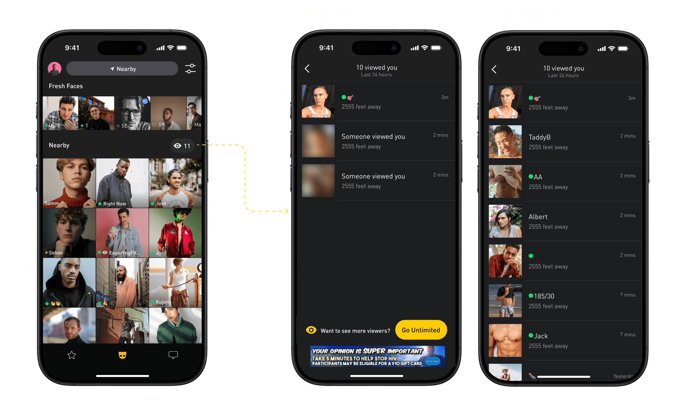
Although users noticed their visitors, a compelling nudge to unlock the viewer list was absent, limiting their willingness to subscribe.
A larger team was formed
Following the quick win, Viewed Me gained superstar status. I successfully secured additional resources for the mission.
The team expanded from 3 people (2 front-end engineers and myself) to 10 members.
Initial Design
What was missing?
Through collaboration with UXR and PM, we identified the blocker that prevented free users from connecting with their visitors.
Blurry visitor profiles really kill the vibe.
When faced with a visitor list, users lacked sufficient cues to determine whom to contact, transforming initial excitement into a disappointing spam list.
95% users were hyper visually-oriented. Viewing uninteresting visitors after clicking into Viewed Me created frustration.
The updated portal generated attention but simultaneously produced frustration due to inability to identify non-interested visitors.

"I only found the latest few profiles attractive because they were comparatively new and might have replied to my messages."
"Getting a new notification was exciting, but discovering it was the same person I had no interest in was disappointing."
Design Strategies
Hypothesis
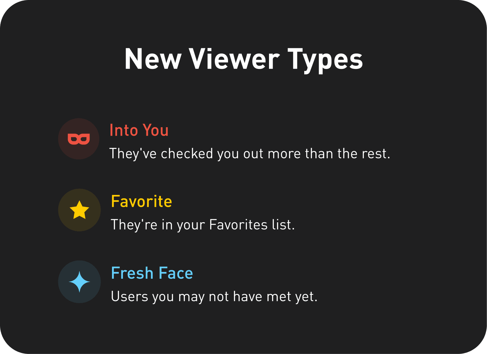
Adding value to previous viewers(= viewers who are not the latest) would have increased users' willingness to connect
Users should be able to identify viewers who were more special to encourage connection actions
Additional information about new viewers before entering the Viewed Me page would have reduced frustration when seeing uninteresting visitors
Users should have more clues about profile viewers before entering the Viewed Me page
What made visitors more enticing
I launched a user survey to identify the most enticing visitor features.
64.8%
of respondents found repeat profile visitors most enticing
39%
valued visitors on their favorite list
30%
valued visitors who were new app users
User's Job To Be Done
I want to know more about new visitors before clicking into Viewed Me so I can reduce navigation between pages.
I need better hints to choose connection-worthy viewers so I can have easier outreach decisions.
User test for disagreements
I conducted user testing to resolve design disagreements between the team and VP of Product.
Tested two positions:
where it ultimately was placed
on the tab bar
Found tab bar placement too distracting and often hidden by thumbs during exploration. As a result, the position remained the same.
Final Design
64.8%
of respondents found repeat profile visitors most enticing
39%
valued visitors on their favorite list
30%
valued visitors who were new app users

Result of Phase 2
Average revenue per user
Click-through rate
Conversion rate
Profile-viewed on Viewed Me page
What I learned
Learned that successful projects involve iterative processes rather than linear progression and focus on understanding true user needs.
Early cross-functional team involvement reduced technical conflicts while generating valuable ideas.
Conflicts provided opportunities for better solutions through communication.